Spotify Library Viewer
When I was a teenager, back in the iTunes days, I used to obsess over my music library..
I used to really love the process of seeking out and downloading new music, knowing that I could always find it waiting for me in my library.
When I wanted to listen to music, but didn’t know what to listen to, I could scroll through my artists and search for some hidden gems that I hadn’t listened to in a while, or had forgotten about entirely.
Since then I, like many others, have made the switch to Spotify where the music available is essentially endless. As amazing as it is to have virtually any music at my fingertips without having to seek it out, I can’t help but miss the notion of maintaining that library and having it for reference. I miss being able to stumble across and rediscover forgotten artists in my music library. Not having the ability to do so has changed my music-listening habits, and I find myself gravitating towards the same artists over and over again.
That’s not to say that Spotify doesn’t have a notion of a library. Spotify does allow you to ‘follow’ artists and ‘like’ albums, which saves them to a library unique to your user, however I’ve always found the functionality rather odd.. For instance:
No ability to browse by artists
Spotify actually seems to go back and forth with this one. Until somewhat recently, Spotify only allowed you to browse your most recent ten or so artists, rendering that browser essentially useless.
Confusing library interactions
As mentioned, Spotify currently allows you to ‘like’ albums and ‘follow’ artists. From what I recall, there was previously an era where you could ‘like’ artists as well. All ‘liked’ albums are displayed in the album view, and all ‘followed’ artists appear in the artist view, regardless of if any albums are saved.
It get’s confusing though. You can ‘follow’ an artist without ‘liking’ any of their albums. In this case, artist still appears in its view, but it routes you to the artist’s Spotify page rather than to their albums in your library.
It’s not terrible, but the mixing and matching creates a bit of a confusing experience and lots of people seem to be complaining about it online.
Poor album viewer
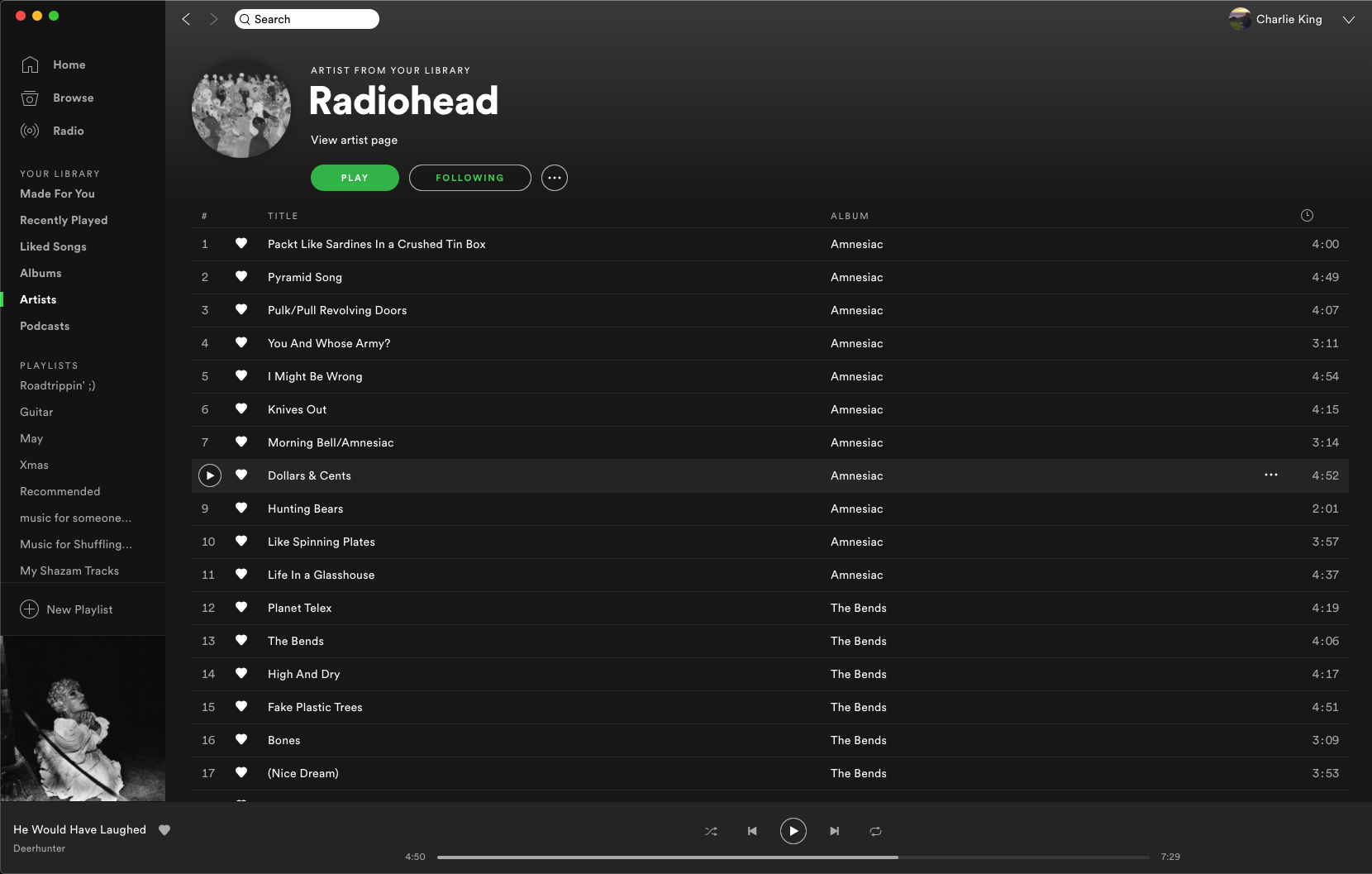
None of the above is a dealbreaker to me until we get to this point. While confusing, you can still navigate to albums via artist however, once there, every album enumerated is displayed with all of the albums’ songs, as depicted below:

For artists with a rather lengthy discography, this can be a huge list! I don’t really understand why the UI is this way, but there’s no way I’m going to scroll through hundreds of songs to find an artist I like. It seems this is sentiment is shared online!
So why is this?
For everything else Spotify has going for it, it’s generally pretty strange to me that the library is so clumsy. It seems as though just about anybody could tell you that enumerating all albums by song is a bad idea.
My theory is that Spotify don’t want you to think of your music collection like a library.
Furthermore, I don’t think Spotify want you thinking about any of the music as yours at all.
While internet-hosted music such as Spotify makes music massively more available, it also means that music could disappear from the service at any time, for legal reasons or otherwise. I don’t think Spotify want users getting too attached to music that might disappear at any time. Without tracking it in a personal library, it’s much easier for music to disappear unnoticed, without upsetting any users.
The solution
With some extra time on my hands, I figured I’d take a stab at finding a workaround to this that might better suit my needs.
Enter the Spotify Library Viewer

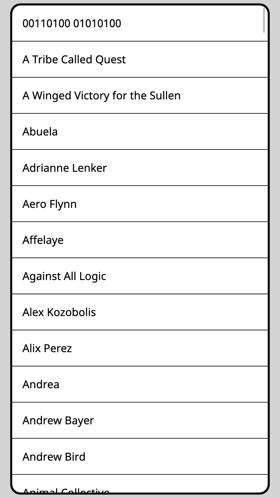
Available at library.cha-king.com, the app is intentionally as simple as could be.
You authenticate with Spotify and are then immediately taken to a basic two-page view, where you can
browse your entire Spotify library of ‘liked’ albums by artist and then album. When you select an
album, Spotify opens to the selected album on your device.
Simple.
Implementation
Check it out on Github!
Code
I’ve been playing around with JavaScript for months now, but haven’t yet had the chance to take a stab at any client-side code. I wanted this app to be dead simple, so I figured that this would be a good, practical place to start. To this end, I also steered away from using any common frameworks like React since I wanted to get some experience with vanilla JS and get a sense for the shortcomings that justify all of these frameworks.
JavaScript is continuing to grow on me, and it was really fun getting to flex promises and async/await syntax for concurrent requests to the Spotify API. Really cool seeing how much everything sped up once doing things concurrently.
OAuth
The aspect of this I was dreading the most was going through the OAuth2 hoops to authenticate against Spotify, but it wasn’t as bad as I expected, and Spotify’s API docs have a really useful guide that really solidifed my grasp on the various OAuth2 flows. I ended up opting for the Implicit Flow so that I was able to keep this app entirely static.
Spotify API
I always enjoy exploring popular services’ APIs, and Spotify’s is no exception. I do a fair amount of API design at my work, so it’s always good to get a good reference.
Client APIs
It was also good to get a bit of experience working with client-side APIs, which is relatively new to me.
I ended up utilizing both localStorage and sessionStorage for caching access tokens and validating
redirect URIs.
Hosting
The app is currently hosted with Github Pages at absolutely no cost to me. Woo! It’s great to me that developers are enabled to host webapps for free so easily. I did run into lots of unexpected behavior propagating updates that I’ll attribute to Chrome’s caching, even after clearing all caches / cookies, but you can’t really fault Github for that!
Styling
This was also the first time I’ve really put any effort into styling! The app is obviously pretty minimalistic, but I had a lot of fun working on the design and improving my CSS. I opted for a mobile-first design, which I think improves the user experience a lot.
Closing thoughts
Overall, this was a really fun project to kill some time on over the course of a week or so. I’ll likely make a few minimal tweaks, mostly style-based, but overall I’d like to keep it as simple as possible.
The notion that static files hosted entirely for free can provide such functionality is really cool to me. This is definitely something I’m going to be doing more of in the futute. On top of that, it’s new to me getting to put an app out into the wild that so hands off! I don’t have to worry about managing any servers or handling any credentials, which is a big stress relief. It’s interesting working with client-side code where security is so first-class.
I’m coming to really like building web apps, and it’s great getting to practice my HTML/CSS/JS! I don’t think I’d ever see myself as a full-blown UI/UX or front-end designer, but the full-stack space continues to appeal to me.
I really like this app because it caters to my design preferences. I wrote this app because I had a personal annoyance I wanted solving. Knowing that I’d be using this app, and having a great sense of the issue really made developing this much easier.
When the problem is simple, the solution can be equally simple.